


Books That Unexpectedly Changed the Way I Dress

As a fashion merchandising consultant, I’ve always kept an eye on key seasonal colors. They often vary across different markets. For instance, in Italy, the stylish crowd tends to wear black in summer and navy in winter, while in many other countries, black is the ultimate winter staple.
Take burgundy, for example. Many people associate it with fall and winter, but there’s a global shift towards breaking seasonal color norms. Brands are now introducing more dark shades in spring and light tones in fall. This shift is crucial to consider when planning seasonal assortments.
But what about personal wardrobe colors?
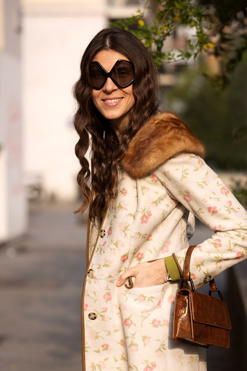
I’m not a fan of black and usually prefer navy, yet my wardrobe is filled with complex shades — warm and cool yellows, matte and glossy burgundies, and a whole spectrum of greens. Color is probably the most important factor in my purchasing decisions.
Even with such a diverse palette, I try to really wear most of the things I have rather than just admire it in my closet. But at some point, I realized I had only 1 or 2 set combinations for each piece and rarely experimented beyond that.
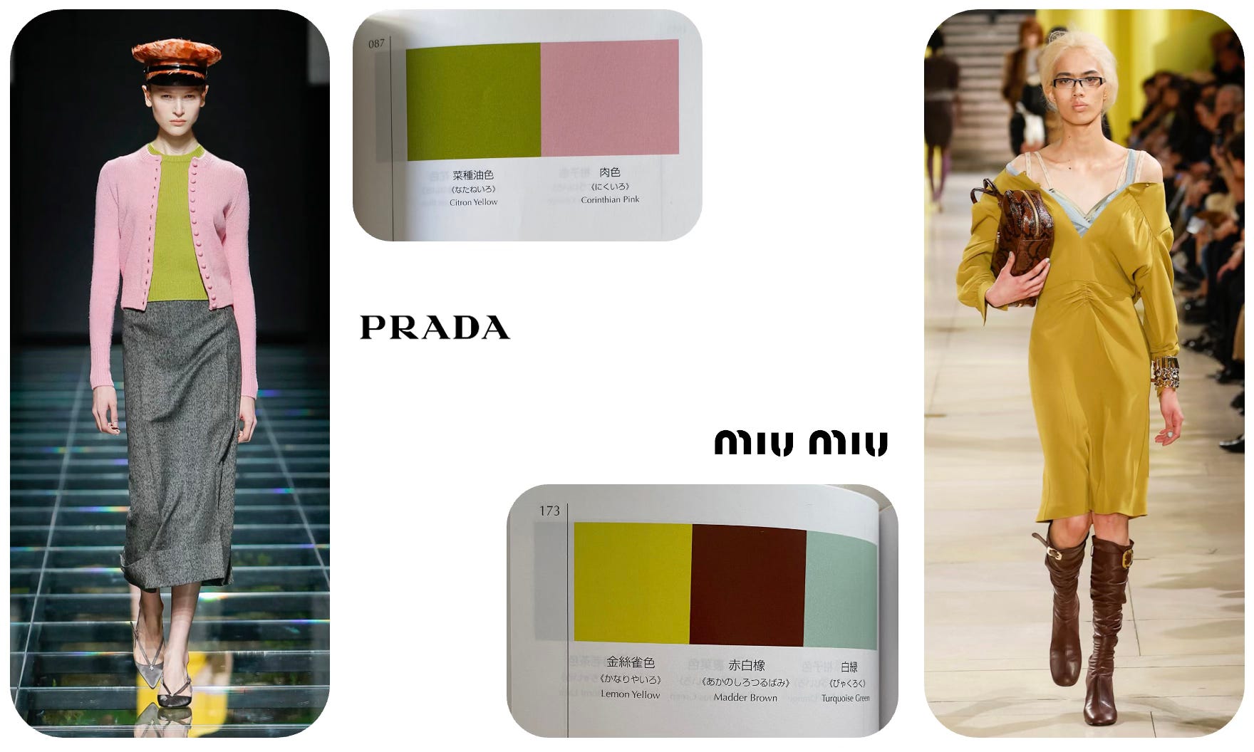
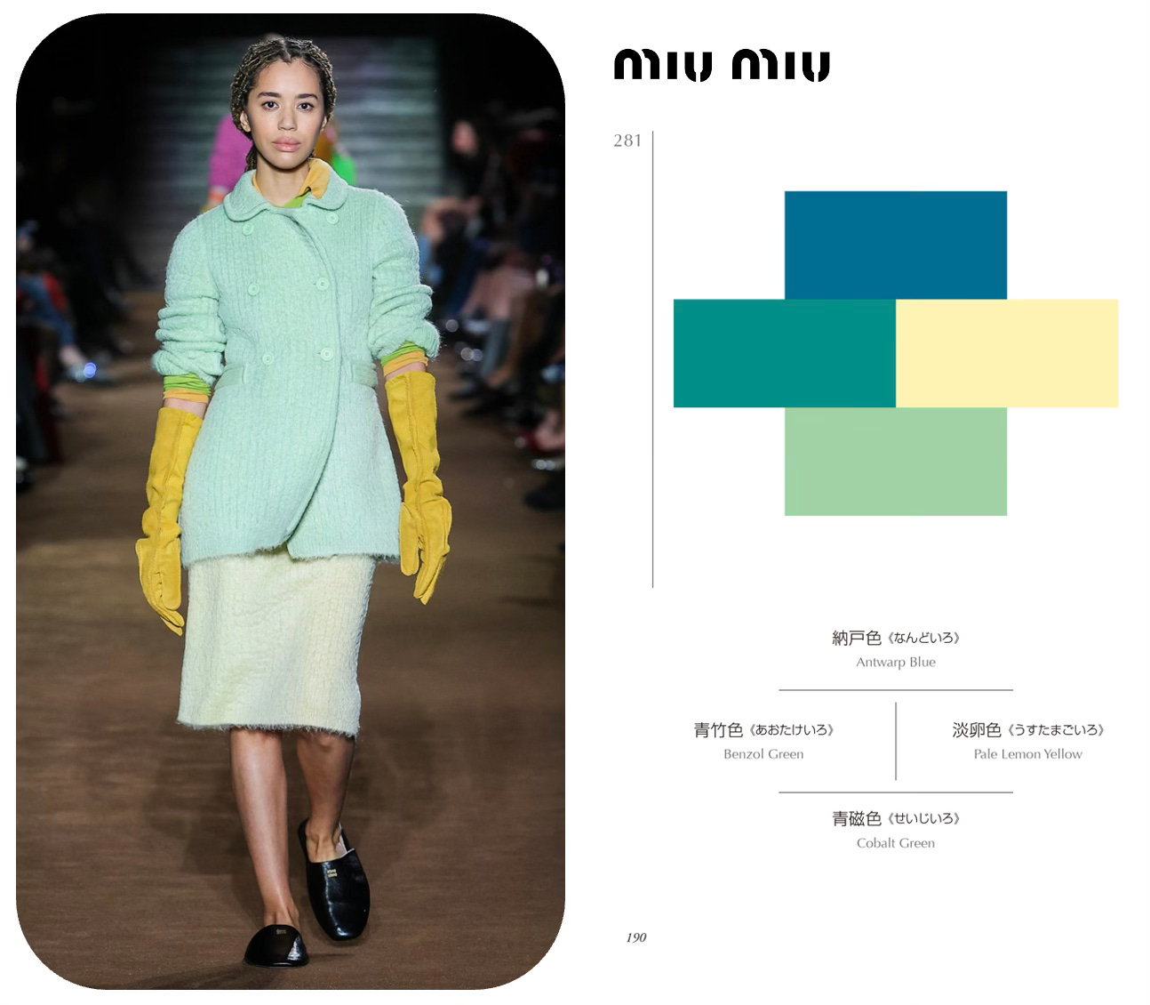
Years ago, I read about The Dictionary of Color Combinations, a book that was reportedly a staple for Miuccia Prada.
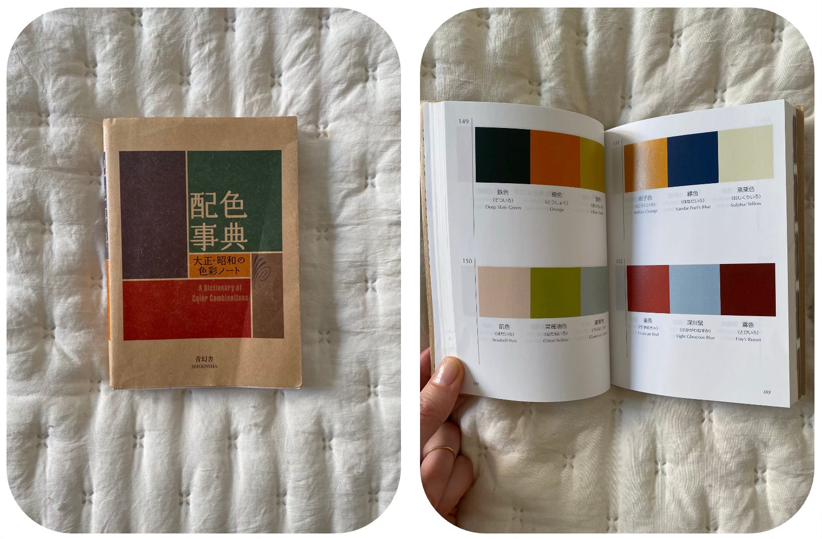
It’s based on The complete collection of color combinations (Haishoku Soukan) by Sanzo Wada, originally a six-volume work now condensed into two reissues. The first volume features 348 color combinations — an incredible summary of the Japanese approach to color. If you can’t find the book itself, you can see Wada’s vision in the 1953 film Gate of Hell, for which he won an Oscar for costume design. You can also explore his work online here.
I bought the book a few years ago and often see color pairings in Prada and Miu Miu collections that seem inspired by Wada’s work. However, I struggle to be inspired by color swatches alone — I need to know the story behind them.
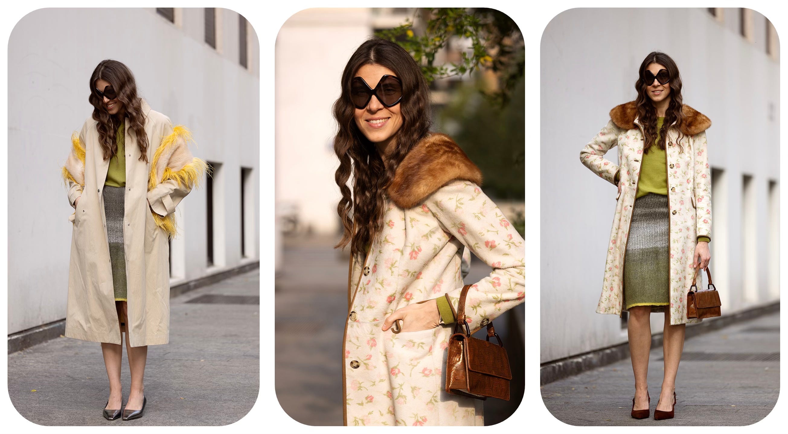
Recently, while rewatching the Miu Miu FW2025 show (one of the best collections of the season, in my opinion), I decided to experiment with accessories and shades.
The next day, while shopping for a birthday gift at a bookstore, I stumbled upon Chromatic Herbarium — and it blew me away!
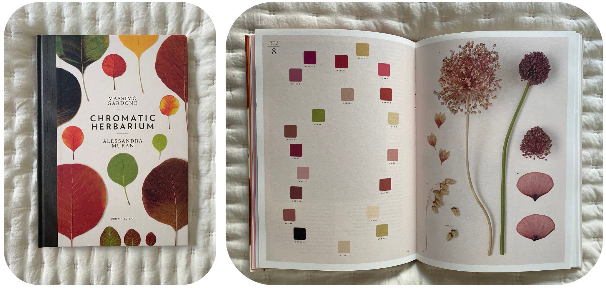
I randomly opened a page, and there it was — my outfit from the day before, deconstructed into Pantone colors and paired with a stunning botanical reference.

I did the quick pantone decomposition in Power Point later, but even in the bookstore it was obvious!
The more I flipped through the book, the more inspiring combinations I found. Here is another great example of how to add darker shades of brown to the similar herbarium outfit!

And that’s exactly the way I did it couple of days before!
Of course I took the book home and spent hours styling new outfits from my wardrobe in fresh color combinations.
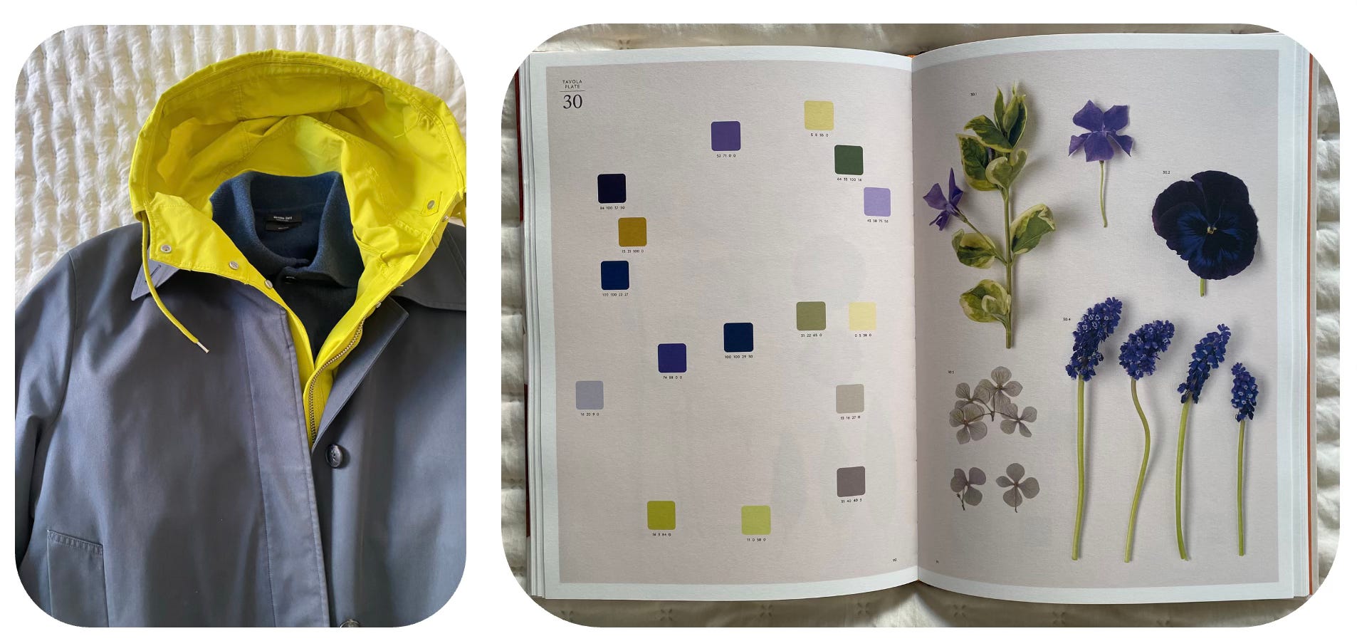
For example, I realized that mossy greens of my Prada vest and Arket parka could be paired with Dries Van Noten soft pink beaded necklace, burgundy leather pants, and a small lilac accessory.
Normally, I would have defaulted to pair them with navy, but with such a clear example in front of me, why not try something unexpected?

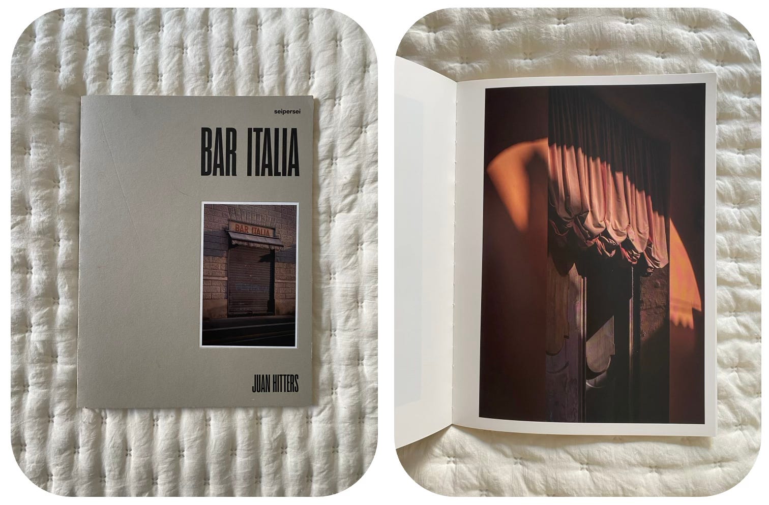
This reminded me of another photographic book I own — Bar Italia, a collection of rich, nuanced color pairings inspired by Italian street scenes. It’s more abstract than Chromatic Herbarium, but equally inspiring.
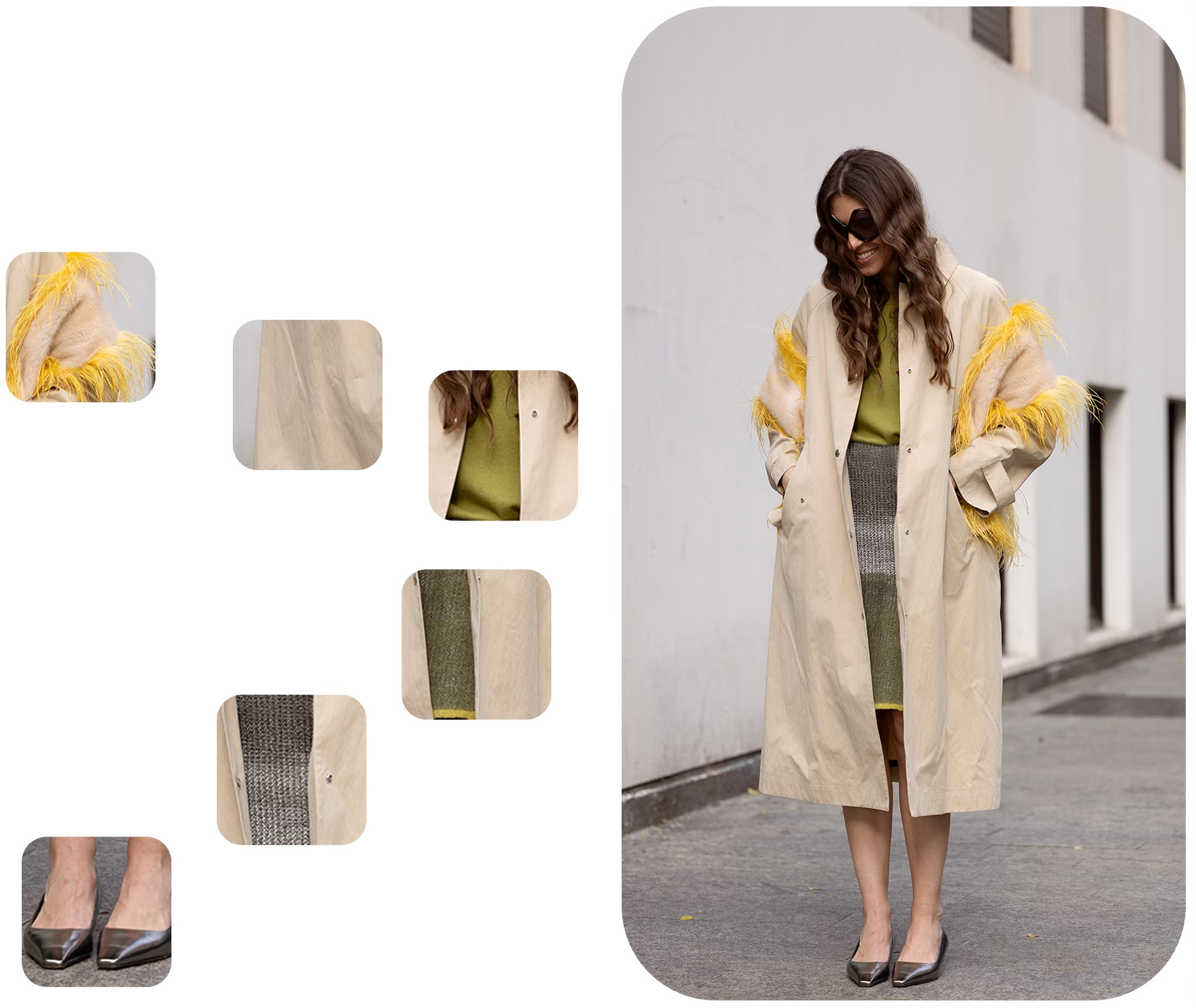
For instance, I recently bought on resale a bright yellow-green Arket parka. But when I tried it on, I realized that until summer (and a tan), it’s a bit too much on its own. I needed to tone it down.
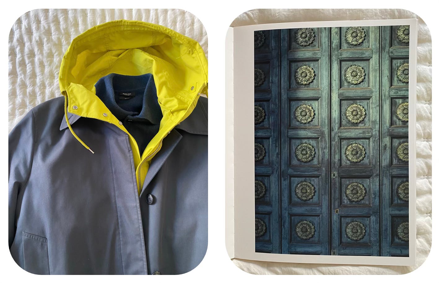
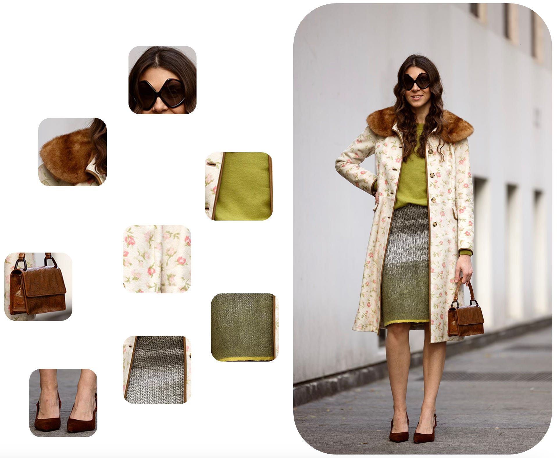
Then, looking through Chromatic Herbarium, I saw that adding lilac and deep violet would work beautifully—something I never would have thought of myself!
So for me it was a kind of discovery that books that aren’t even about fashion can totally change the way you see color in relation to clothing.
Unlike classic styling guides that give you ready-made combinations, these unexpected finds — whether they’re about plants, art, or cityscapes — help you look at your wardrobe with fresh eyes. They push you to mix things up, notice new connections, and step outside your usual color habits. Instead of sticking to safe choices, you start playing with shades in a more natural, instinctive way. And sometimes, all it takes is one random page in a book to spark an outfit idea you’d never have thought of on your own.
Amazing post! Very resourceful! Thank you for sharing books ans inspiration. Thank you for introducing Sanzo Wada! Japanesse culture is super interesting
Fabulous, love the article. Wish that I could be more original.